Terminology inconsistency across screens
→ standardized all session language to "Session"
Design and ship a working AI product in 48 hours — for a topic revealed only at the start of the event. The stakes: top 3 teams get deployed to real users through an NPO channel.
The product had to work, hold up under real use, and feel polished enough to earn user trust in under two days.
Most EdTech is consumption-first: watch, read, quiz. The Protégé Effect, a well-documented learning science principle, shows that teaching someone else significantly improves comprehension and retention.
TeachMe flipped the model. The AI plays the student. You do the teaching.
The topic was unknown until hour zero. Instead of starting from scratch when it was revealed, I spent 9 days before the hackathon building a flexible, token-based design system.
I interviewed the engineering team first, they were using React with Styled Components, and aligned Figma token naming to their CSS variable structure before writing a single component. When the hackathon started, the color decision took under 30 minutes. I built 4 full variants using Figma variables, the team voted, done.
A single neutral AI voice feels like a search engine. Users respond tersely, without depth. I designed a persona system built on two axes: age level and personality type.
Each combination produces a genuinely different character, a warm elementary school student asks very differently than a sassy expert. Users naturally calibrated their explanation depth and language to whoever they were teaching. The teaching behavior happened without us instructing it.
The personas were also emotionally reactive. When a user clicked "Wrap up this session?" mid-session, the student avatar visibly showed disappointment. A small detail, but one that made the AI feel less like a tool and more like someone you were actually teaching. Users were less likely to abandon a session.
Users select learning keywords before the session starts, based on an AI-generated list for their topic. During the session, a progress bar tracks which keywords have been covered in real time.
Most conversational AI follows a fixed script.
Question → answer → next question, regardless of what was actually said.
I worked with engineering to define prompt logic where the AI classifies every user response into one of three categories, then responds accordingly:
Each path required a distinct UI state. I mapped and designed all three before engineering built them, not after.
designing for LLM conversation means designing for variability. The AI does not always respond predictably. Define the edge states first. Design the UI to hold in all of them.
Engineering flagged voice integration was out of scope. Moved to text chat.
Cost with the pre-built system: 2 hours.
The student photo created an uncanny valley effect, the AI felt too human. Replaced with a simple illustration. Cost: under 1 hour using component variants.
Ran a testing session during the build. Four findings, four immediate actions:
After the core chat was working, internal review revealed a gap: there was no accumulation. No reason to come back.
I designed a session feedback dashboard showing four signals on a 1–10 scale, visualized as a chart:
per-keyword summary, mistake correction, and review materials. Feedback tone adapted to the persona, a warm elementary student gave encouraging feedback, an expert gave detailed critical analysis.
Three-phase product roadmap I defined:
Rather than asking engineering to adapt, I updated the token naming in Figma to match their system and re-exported. Fixed in one sync.
Token naming alignment must happen before building the system, not after.
Add Google SSO The simplest friction reduction: one click instead of a form. I designed the updated authentication screens to include Google sign-in alongside email, keeping both paths clearly visible without one overshadowing the other.
Try first, sign up later (designed, proposed for next sprint) I designed a guest flow that let users start a teaching session without an account, then prompted sign-up at the natural value moment, when they wanted to save their feedback report. This was designed and prototyped but not implemented before the product went offline.
Adding Google SSO reduced sign-up drop-off by ~50% and nearly doubled the rate of users reaching their first teaching session.

Note: Sample sizes are small. These numbers are directional, not statistically significant. The pattern is consistent with broader research on SSO adoption reducing authentication friction.
Authentication is not an engineering concern dropped at the start of a product. It is a UX decision that determines how many people ever experience what you built. The moment you ask someone to commit, and what you ask them to commit to, is a product design choice with measurable consequences.
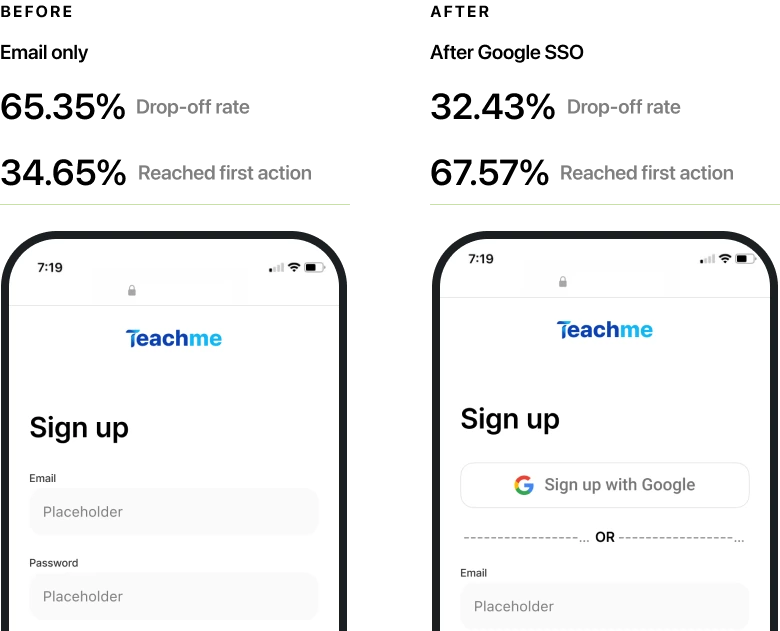
Data-driven decision-making (50% reduction in drop-off rates following the implementation of Google SSO)
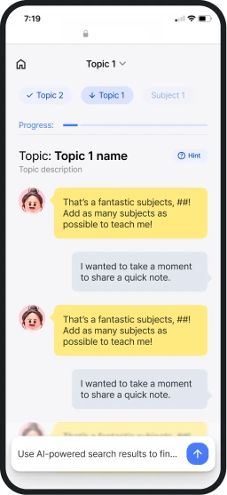
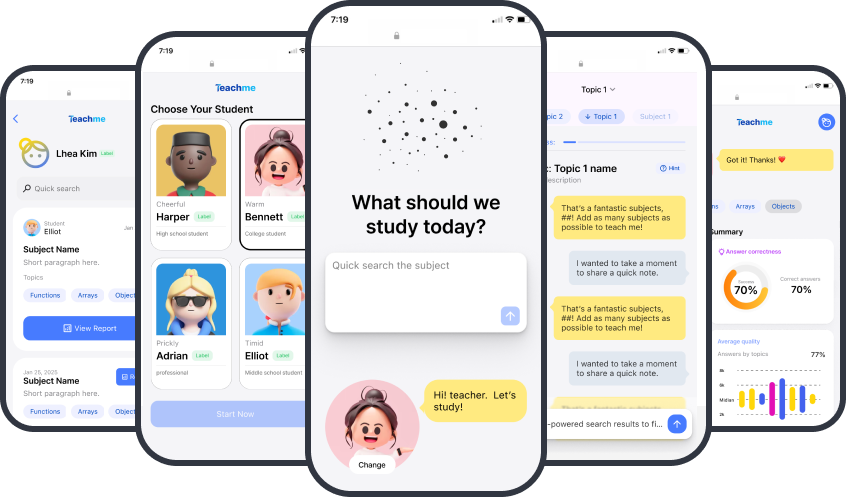
1st place, most votes. Judges specifically cited the consistency of AI interactions and recognized the team for innovation.
the NPO launch did not happen due to an organizational issue. Post-hackathon, API costs became unsustainable without funding. The product went offline.
A well-designed product still did not reach users because the infrastructure was not ready. Release conditions, cost sustainability, and gradual rollout are part of the product design problem, not separate from it.
Note: The live product is currently offline following the hackathon due to API infrastructure costs.
Thank you!