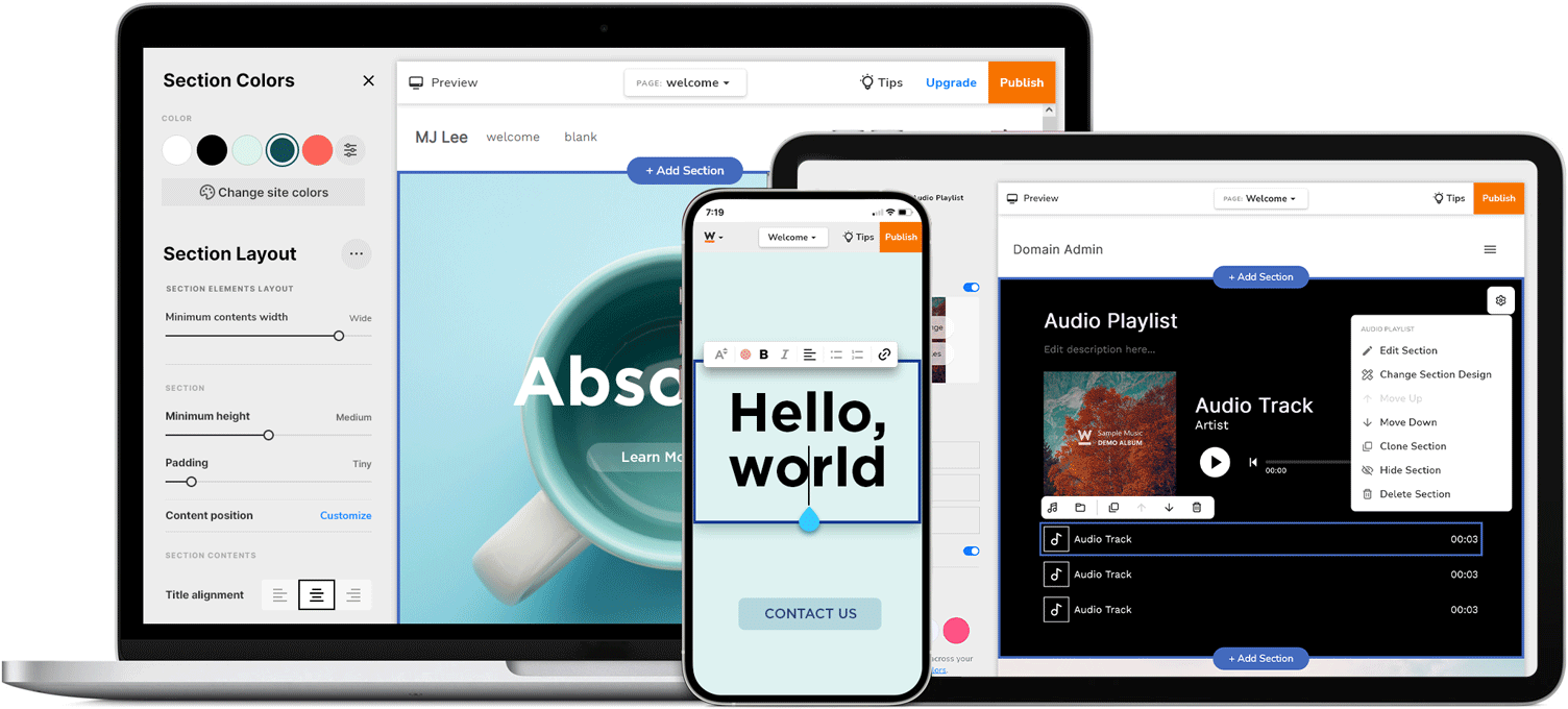
I played a pivotal role in transforming a website editor dedicated to empowering users to build their own websites. Leading with a user-centric design approach aligned with the business goal of acquiring customers and boosting retention. Through extensive research, every design choice resonated with user aspirations, resulting in a significant increase in both user retention and online publishing rates. The initiative successfully attracted more paid customers, culminating in a harmonious blend of user delight and strategic innovation.
Empowering Digital Creativity
The website editor redesign was successful in providing users with an easy and intuitive experience, including mobile optimization and streamlined controls. This led to improved user engagement and retention for Website.com

Our team had identified key challenges affecting the user experience of our DIY website builder. Only 20% of users publish their websites, despite a 15% increase in new sign-ups. Additionally, the platform had a high bounce rate, indicating low user engagement. The conversion rate from free plan users to paying customers was notably low, highlighting the need for improvement in the user acquisition process.
Our target audience included existing users facing challenges with the website builder and potential new users hesitant to engage with the platform.
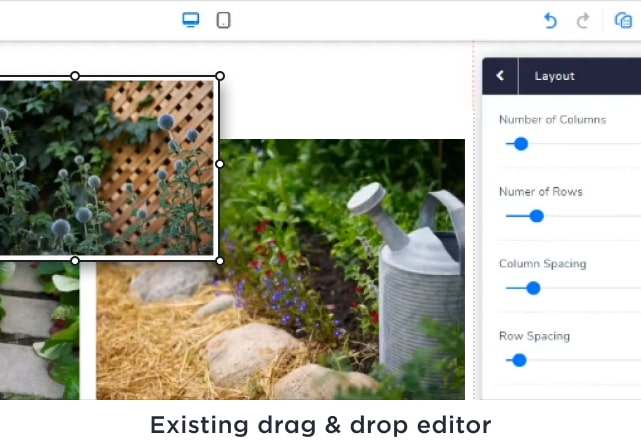
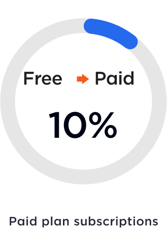
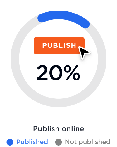
To address these challenges, we had set clear business objectives aimed at enhancing customer retention and acquiring new customers. Specifically, we aim to improve the conversion of free plan users to paying customers and enhance overall user productivity and satisfaction.
Our ultimate goal was to create a more satisfying and engaging user experience while also driving sustainable business growth.
We had established the following key performance indicators (KPIs) to measure our success:
These KPIs guided our efforts as we developed targeted solutions and strategies to bridge the gap between user expectations and the website builder.

Through user testing analysis, I developed UX solutions such as an Introduction Modal, breadcrumb and back button, and mobile inline editing to address common pain points around navigation and editing. These changes significantly improved the user experience and workflow.
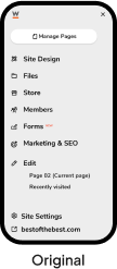
"I wasn't sure where to begin."
This indicates a potential usability issue with the current onboarding process and the layout of the dashboard on mobile devices. Users' initial confusion may lead to a suboptimal experience and a higher likelihood of abandonment.
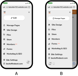
75% of people chosen B
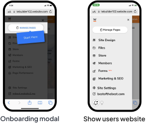
“I'd like to return to where I was doing”
Users wanted to go to the main dashboard wherever they were and also there was a confusion of going back and jumping between the contents edit and management/setting menu in the same area.
So we used a brand symbol going to a dashboard instead of sending users to website and also indicate the start. However, the breadcrumb area had also a problem of spacing, so we did another user testing if the home link, with simple question, how the user find the dashboard without the wording only using micro interaction.
“I want to edit by simply clicking where I want to change”
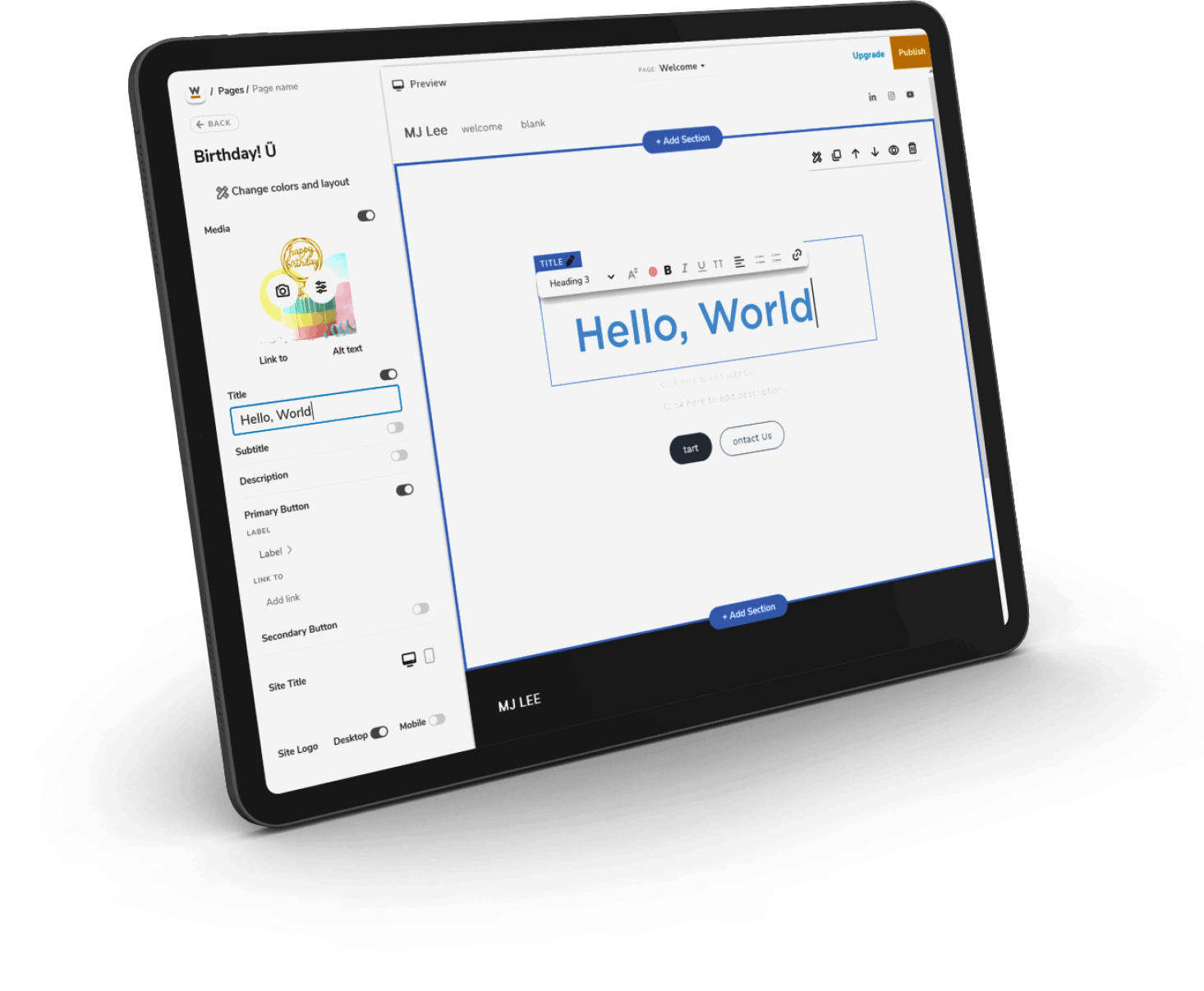
Edit from the side and inline
Mobile inline editing added based on user feedback, enabling users to edit content intuitively and without restrictions.
It's abet related to the technical constraints. We did just shipped without this function because the get it out as quickly as possible was our priority. However, with the help of the engineers, the website editor can now inline edit on mobile as well.
Designed the mobile editing page to users could focus on the edit.
Decided to use only premade layouts and components for the new editor because in the element usage analysis, the card element, a ready-made element, was used more than any other stand-alone element, such as text or image.
To enable a clear layout search, I emphasized the categories at the top and to show a closer preview of the generated content, I took up the entire viewport.
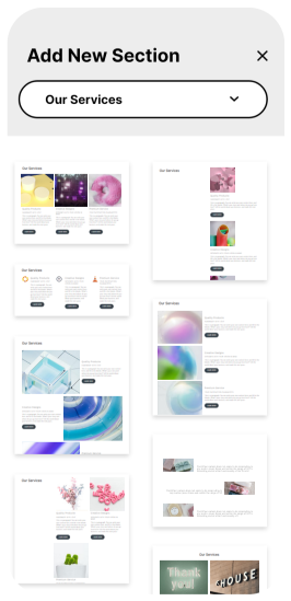
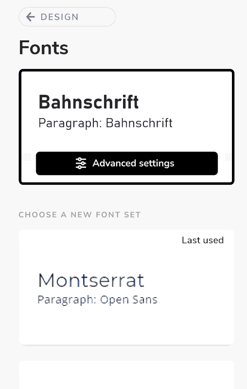
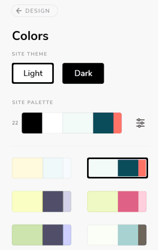
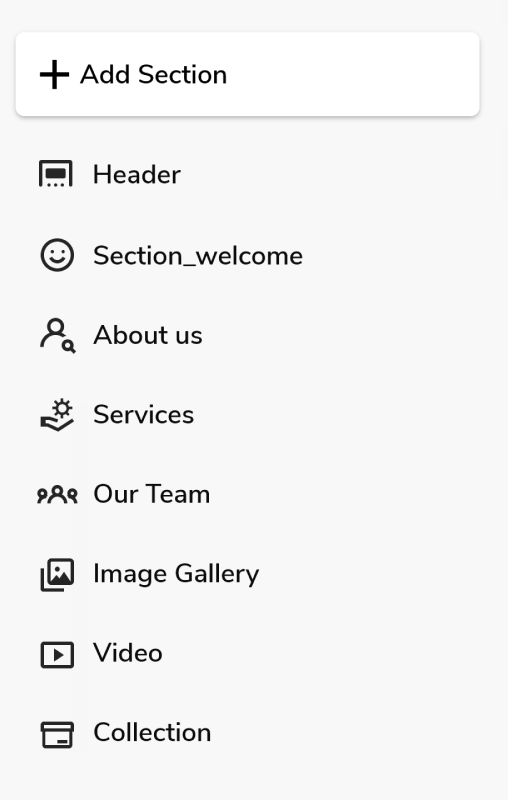
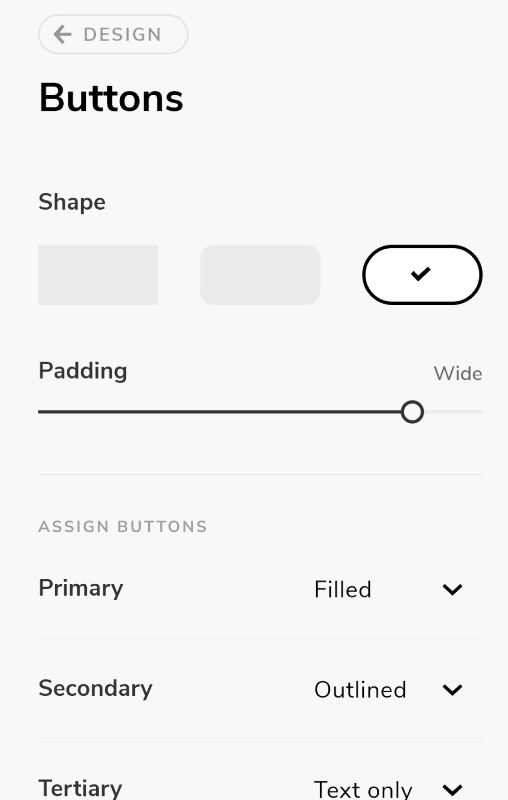
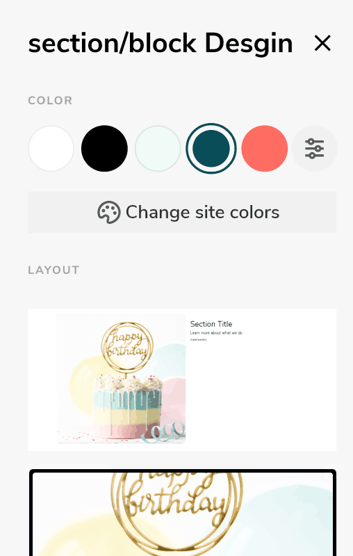
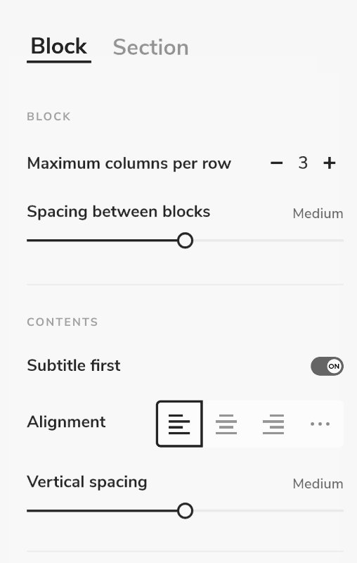
For the users not too overwhelmed but less clicking while keeping the web accessibility, we decided to the main design options simpler and advanced choices were condensed and hidden. Because we discovered that most users preferred existing design settings and only made minor adjustments
It saved the user's site-making time. For example, 1 website in 6 hours.
Thank you!