Design Solution
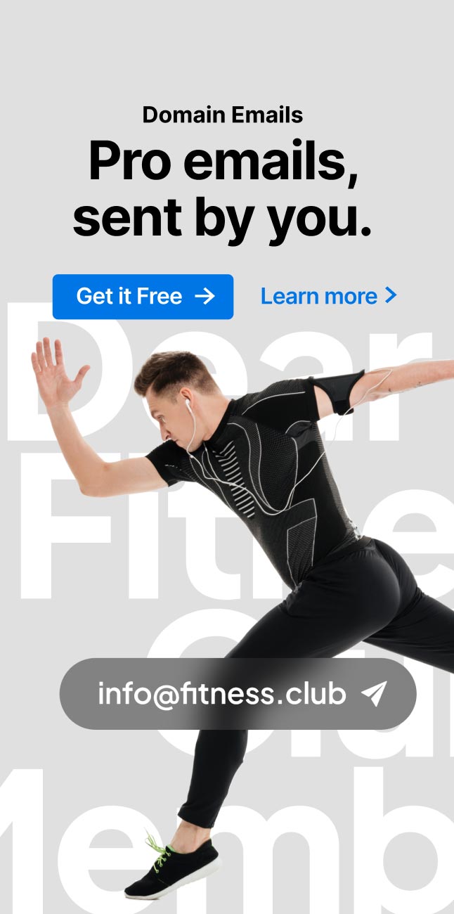
Keep the brand identity obeying the principles of visual hierarchy
Bold typefaces for emphasis on the products
Impactive space usage to draw attention to the product
Clear and customized images showing brand trustworthy
 Typography
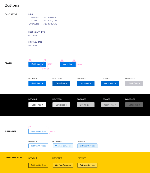
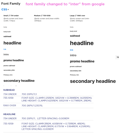
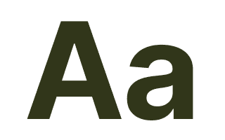
We chose the Inter font family, known for its pleasant and legible qualities that convey elegance. We also incorporated Jakarta Sans, a sophisticated typeface that complemented both large text arrays and small sentences. After conducting user testing, we found that 12 out of 15 people preferred the Inter font family.
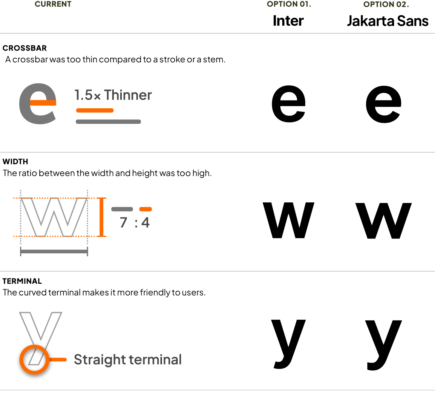
Inter bold & semi-bold sets selected.
We asked random people. 12 out of 15 chose the “inter” font family.

 Colors
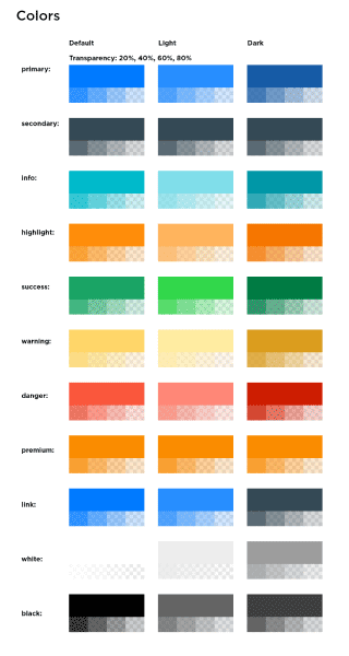
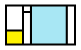
I selected blue as the primary color to create a welcoming and friendly atmosphere for users. Yellow was used to grab user attention and encourage quick decision-making, while orange, the brand's accent color, added a pop of friendliness and warmth.
Blue
Trust, loyalty, wisdom, and confidence.
Yellow
Happiness, cheer, and optimism.
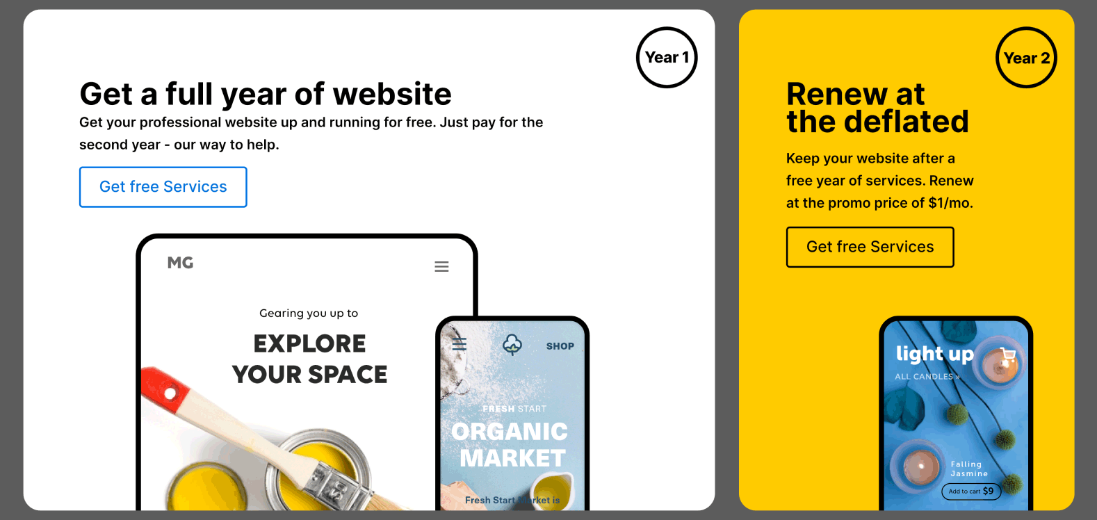
- High contrast grabs the user’s curiosity and wondering what’s next.
- Based on Gestalt laws, I clustered relevant items together.
- Visually distinguished between related and unrelated elements using alignment, white space, and different background colours.
Orange
- I used orange for an accent for creativity, joy, determination, and attraction to maintain brand identity and emphasize specific products.
 Conversion-Focused design
Increase Visit Duration and conversion rate. Maintain the website's visual identity while adhering to the visual hierarchy rules. Also, place greater emphasis on the product.
Solution 01
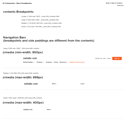
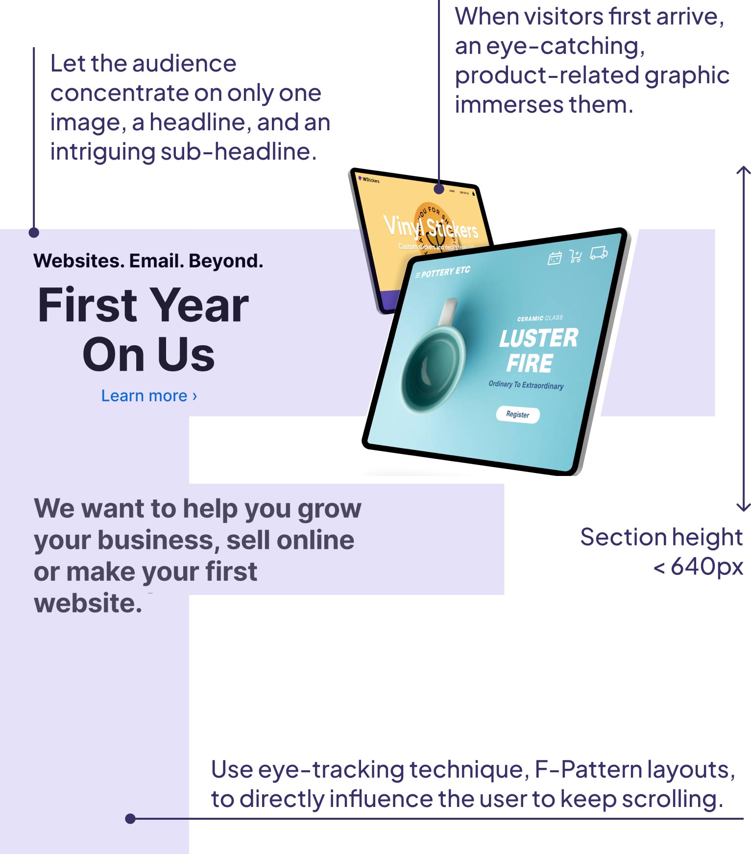
Engage users by expecting and reading underneath the top hero banner that offers other good deals to promote to raise the conversion rate. Review the current display sizes data and limit each section height not to overflow the viewport.
Solution 02
Every product content section has precise, effortlessly readable text blocks and different products presented to attract potential customers and also includes links to allow for conversion.
- The legibility and comprehension improved by using different font sizes.
- Create a solid visual hierarchy that makes the website easy to browse and enables users rapidly understand the service's core concepts.
- Focused on uncluttered, single content regions with lots of white space and large margins that accent one piece of content at a time.
People’s thoughts
- This layout turned out not only aesthetically beautiful but also made it simple to read the text.
- Customized aesthetics and compelling graphic elements performed the visual hierarchy successfully.
Solution 03
- • Add the countdown to engage and motivate customers to take buy actions and create a sense of urgency.
- • countdown Strategically placed the section to alert users to the offer and stress that it was time-sensitive.
- • maximized the attention by using a very contrasting section background colour.

