My team and I worked to diagnose the problems with the existing website-building product by analyzing user feedback and discovered that users were concerned about ruining the site when they changed colors.
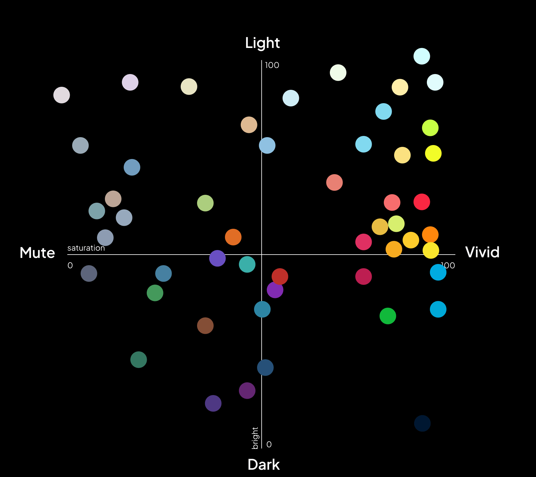
Our research revealed that users often kept the original color scheme or made minor changes. They needed an easy way to manipulate website colors without compromising the design, while maintaining brand identity and accessibility.
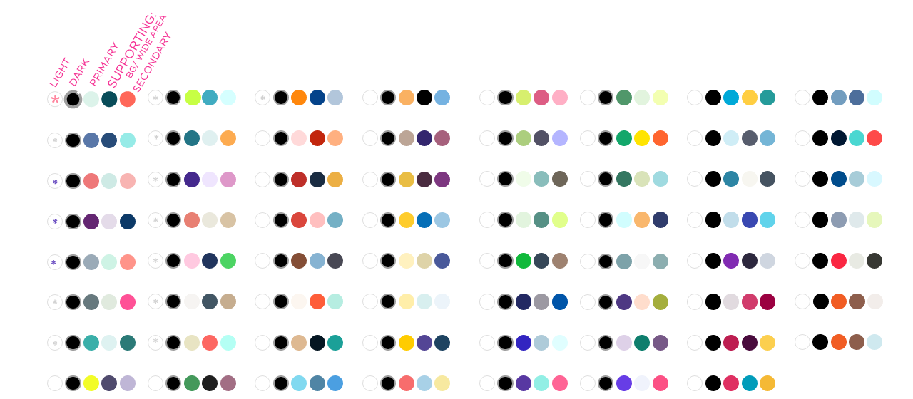
We developed a new color system that enabled automatic color changes, maintained legibility and flexibility, and preserved brand identity and accessibility. This resulted in a color palette that allowed users to change website moods easily without any accessibility concerns.

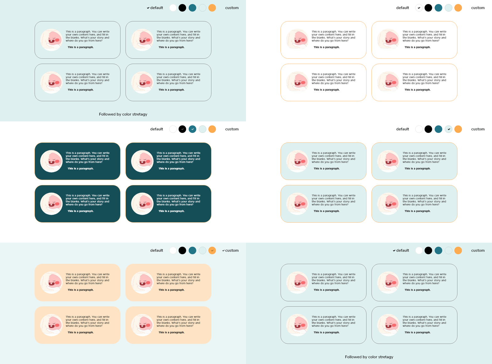
We used the 6:3:1 color golden ratio to select the three main colors (primary, supporting, and secondary) and the monotone colors, black and white. We assigned each element a specific color, enabling flexibility and consistency across the site. All section colors changed automatically with legibility maintained when the user clicked one button.


I introduced the color system algorithm to engineers and explained the color pattern expansion strategy for each element. I created a designated color change method for each case, incorporating the number of cases that can occur in color use when users change layer options.
To implement the color palette mapping strategy for engineers, I derived the number of cases that can occur in color use when users change layer options. I created patterns between the elements affected by the color change for each layout and developed a designated color change method for each case.
Our solution addressed user needs for flexible and accessible color systems while maintaining brand identity and adherence to accessibility standards. The new design color palette system enabled users to easily manipulate website colors without compromising the overall design.

Thank you!